Australasian comic reviews by Philip Bentley.
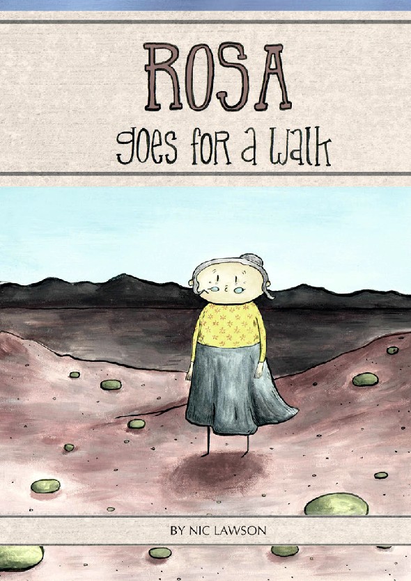
Rosa Goes for a Walk by Nic Lawson (self-published, 2013)
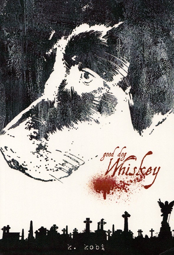
Good Dog Whiskey by Kent Kobi (self-published, 2013)
Comics about the notion of dying are not that common – as opposed to comics featuring death which are fairly thick on the ground. I guess this is because most comic creators are in the full flush of their lives and haven’t had reason to contemplate mortality beyond its use as a plot device. Whilst neither of the authors of the above two works appear to be more than middle-aged both have produced considered, moving works on the process of dying.
Nicole (Nic) Lawson’s Rosa Goes for a Walk is a whimsical, yet thoughtful narrative concerning an old lady living alone in an outback ghost town. Her daily routine is pretty similar until one day she espies a mound on the horizon that wasn’t there previously. Recalling her past life as an adventurer Rosa decides to ‘go for a walk’ into the bush to investigate.
More a parable than drama this is a largely wordless piece illustrated in a simple, yet effective cartoony style. It is a novel take on mortality and cleverly approaches it from a pan-spiritual perspective.
This is a difference between Rosa and Kent Kobi’s Good Dog Whiskey where the afterlife depicted has more of a standard Christian dimension, even if nothing is overtly stated. Whiskey also explores the process of dying, but beyond this is also an evocation of the deep bonds that some people have for their dogs, or in this case vice versa. Kobi manages to pluck the heartstrings in a sincere and moving fashion. Sensitive readers are advised to have a box of tissues handy.
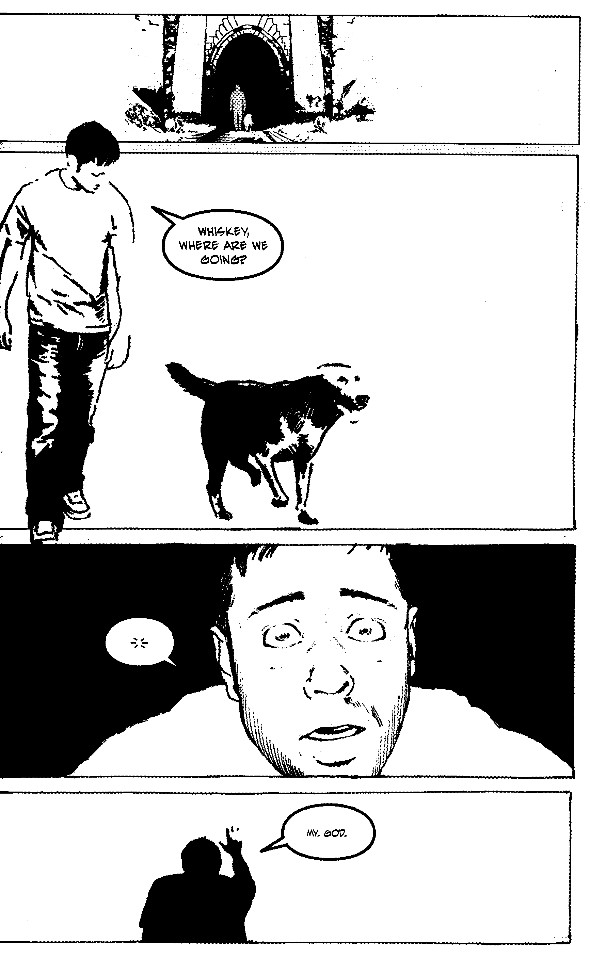
My only beef with Whiskey, and it is a major one, concerns the artwork which appears largely to be made up of rendered photos. The use of this effect is not new (artists such as Jean-Claude Claeys and Fernando Fernandez were utilising similar methods as far back as the 1970s, probably using a light box or overhead projector), but its use has become more prevalent recently with the availability of Photoshop. I don’t want to be too hard – if the choice is between rendered photos or inferior art then the former is certainly preferable – but ideally I’d prefer to see fully drawn works where the element of craft is more to do with the artist’s drawing ability than his computer expertise. Using this process inevitably means that you produce fairly static images, whereas part of the alchemy of the figurative drawing process (both in comics and single illustrations) is to produce figures that have the illusion of movement. Further, there is often a disjuncture between the images that have been rendered from photos and those that haven’t leading to an inconsistent look to the work. Thankfully in this case the story does lend itself to the process, as there is no need for expansive backgrounds, but for me it diminished what was otherwise a commendable effort.
For info on submitting comics for review read here:


